GroupCalendar
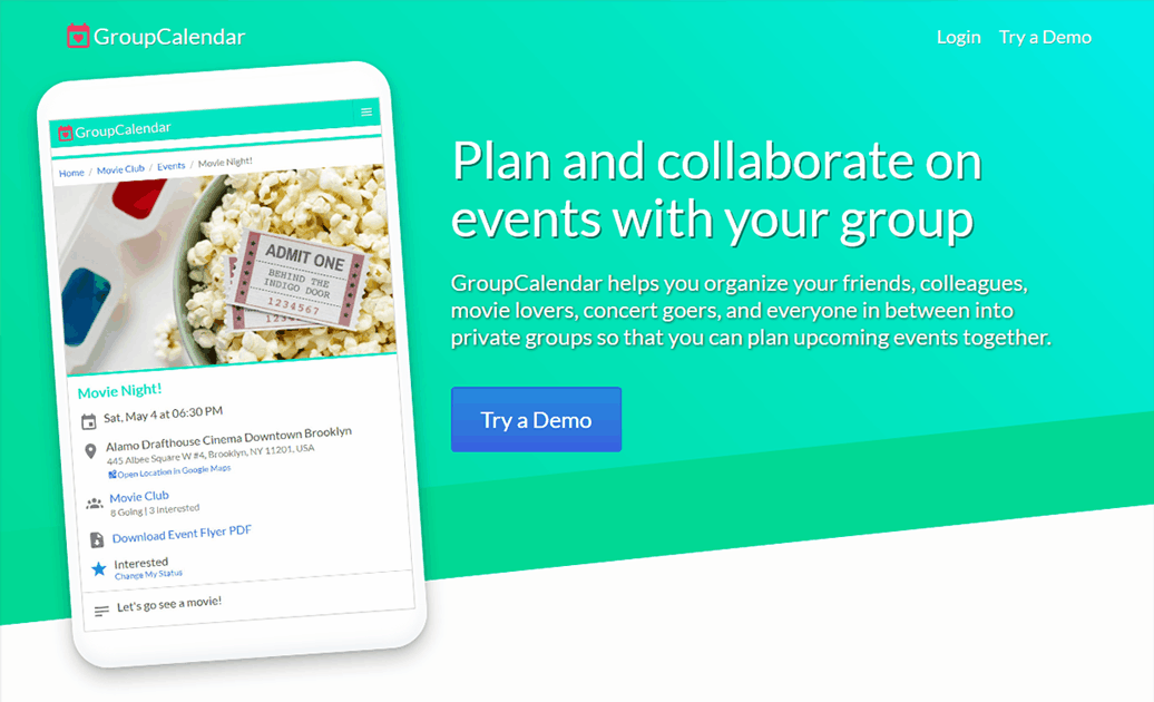
GroupCalendar is a Laravel web app that helps you organize friends and colleagues into private groups so that you can plan upcoming events together. Users can join many groups and events created in groups are visible only to other group members.
The GroupCalendar website is designed to make creating and collaborating on group events easy and intuitive.
Technologies: Laravel, Vue.js, MySQL, PHP, HTML5, CSS3
Event Planning
Datepicker Calendar
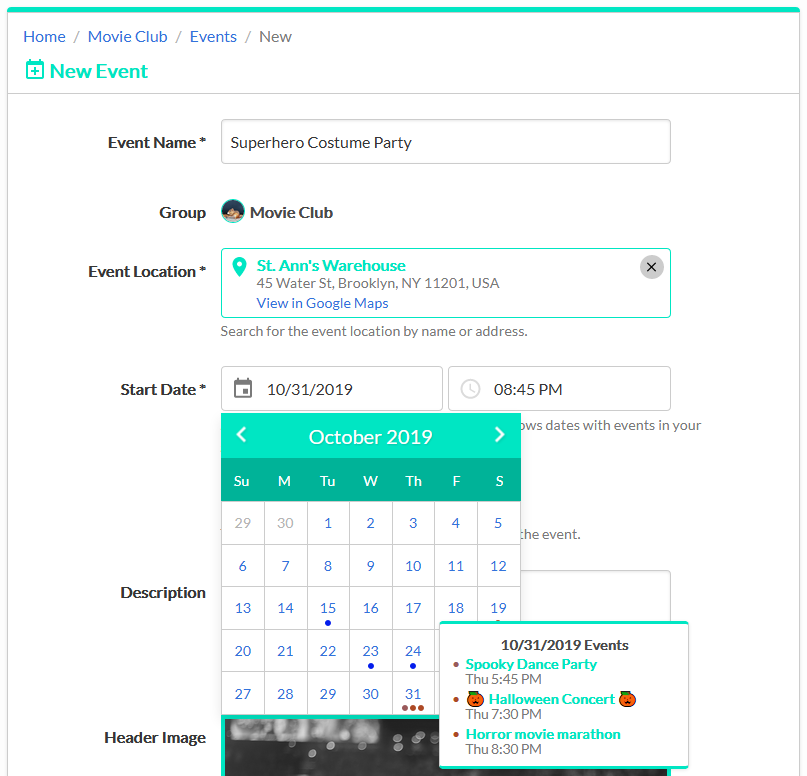
The New and Edit Event forms feature a datepicker calendar tool so that users can visually pick their event dates. The calendar also shows any events from the organizer's other groups so that they can avoid scheduling conflicts.
Location Autocomplete
Another component of the Event forms is the Google Maps Autocomplete widget which lets the organizer quickly set their location by typing a name or address and selecting their result from the autocomplete list. In addition, Google Maps provides a static map image for the Event Flyer PDF once the event is created.
Event Header Image
Organizers can customize the look of the event by selecting a header image from a collection of stock images. The header image is displayed prominently on the Event Details page and the Event Flyer PDF.
Event Flyers
Every event includes an automatically generated PDF flyer which users can download and share. The flyer lists all of the event details and prominently features the event's header image, as well as a map of the event's location.
Group Collaboration
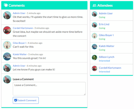
Once the event is created, group members can collaborate by adding comments and setting their attendee status for the event. The organizer and group admins can update the event based on the group's feedback.
The Edit Event form also includes a comment field so that the organizer can add an event comment upon submission and directly inform group members about their changes.
In addition, GroupCalendar features a robust notification system so group members receive immediate feedback about new comments and event updates.
User Experience
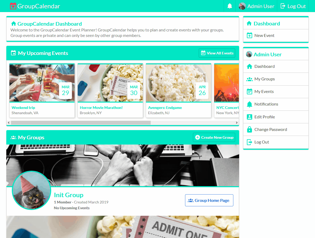
GroupCalendar is designed to be simple to navigate and quickly find details about group events. Every page features a prominent page title, breadcrumb trail, and contextual sidebar navigation.
User Dashboard
When a user logs into GroupCalendar, they are shown their personal dashboard which lists the groups they belong to and a scrollable list of upcoming events in their groups.
My Events Page
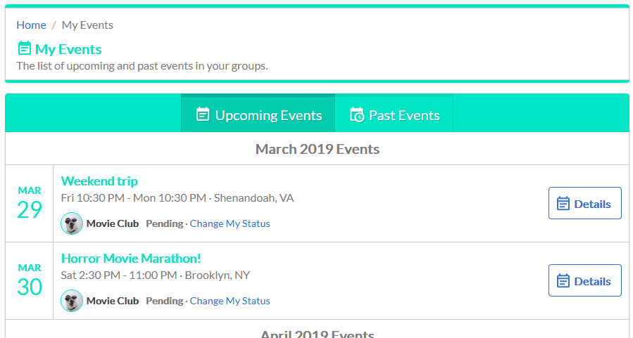
The My Events page aggregates all of the events in the user's groups into one event list, separated by month. The page displays relevant details of events including the name, date, location city and state, group name, and the user's current attendee status. The events listed are also separated into Upcoming and Past Events tabs.
Sidebar Navigation
The sidebar menus are displayed based on the context of the page. For example, the Event Details page features a sidebar menu with Edit and Delete Event links. These links are visible if the user is authorized to update the event.
Below the event navigation menu is a group menu with links relevant to the group that the event takes place in. Below that menu is the user navigation menu which includes links relevant to the user.
Demo Mode
GroupCalendar includes a demo mode to quickly try out the website's functionality. When you visit the demo page, you are automatically logged into a randomly generated test account.
Demo accounts are members of preset demo groups and are able to create events, leave comments, and set their attendee status on events. Other functionality including creating and leaving groups is disabled for demo accounts.
Design
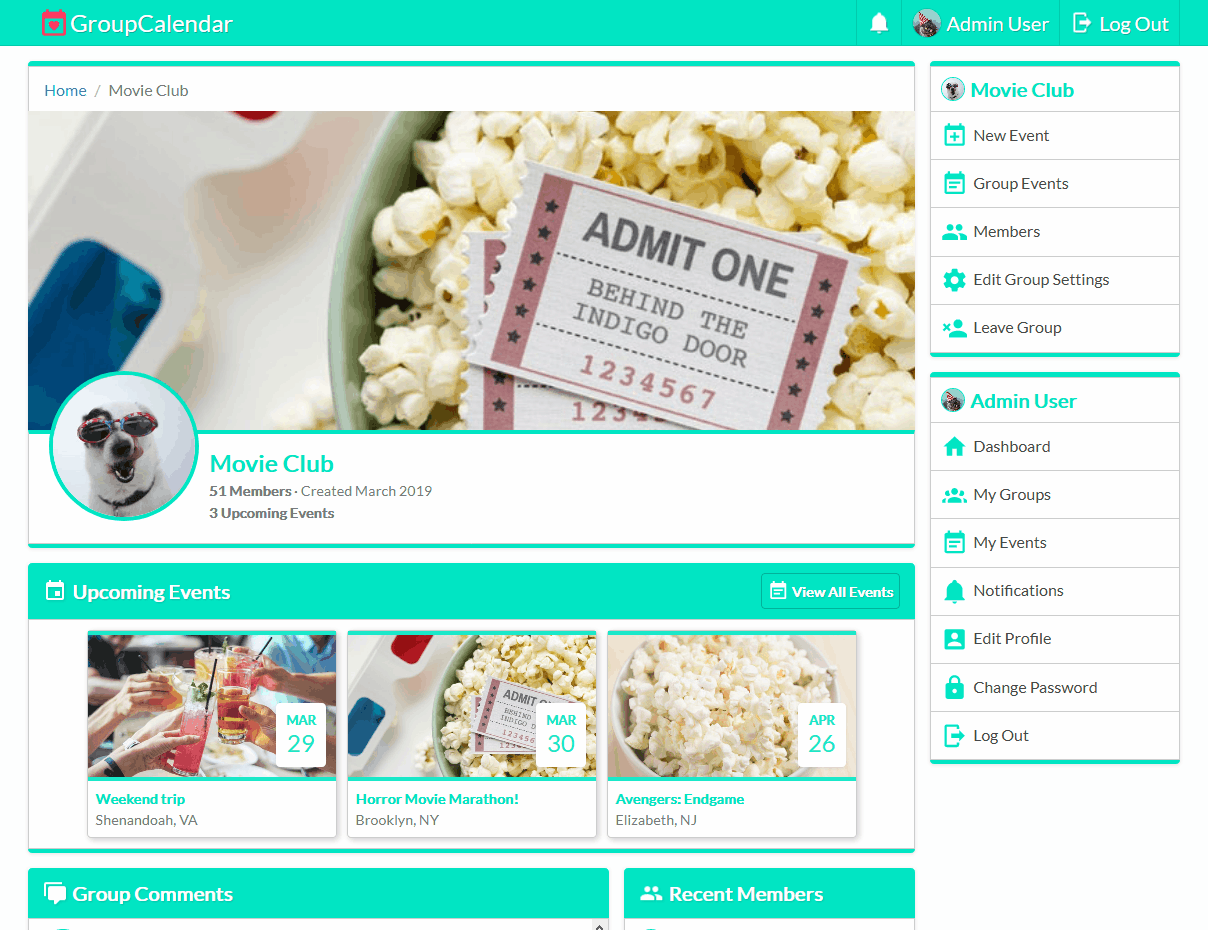
GroupCalendar uses a card based design built with Flexbox to visually separate different sections. This layout is also designed to responsively resize based on the user's screen size without losing functionality. For example, the sidebar navigation menus collapse and become part of the header navigation on smaller screens.
The website's color scheme includes shades of white and grey for most of the page content and turquoise for card headers, borders, and emphasis.
Additionally, SVG icons are used to add extra flair to buttons, links, tabs, etc.

The landing page is designed to be eye-catching and noticeable by making heavy use of the emphasis color in a hero banner design. The landing page is also meant to show off the features of GroupCalendar so it includes prominent screenshots of the app.
Technical Details
Laravel Framework
GroupCalendar is built with the Laravel Framework. Laravel follows a model-view-controller pattern to divide the different aspects of the application into interconnected parts. Database tables are accessed and updated using Eloquent ORM. Laravel also manages the routing and controller actions that occur when a page view is requested and rendered.
Page Authorization
Many aspects of GroupCalendar are only available to a user if they are authorized to access them. For example, groups are private and only group members have authorization to view the group pages.
Authorization in GroupCalendar is defined and managed using Laravel's authorization policies and gates. When a user tries to visit a page, their authorization for that page is automatically checked by middleware on the page route. Based on the user's privileges, they are either allowed to view the page or they are automatically redirected to a 403 Not Authorized status page.
Additionally, the navigation links in the sidebar menus are displayed based on the user's privileges. When a group admin or event organizer visits the Details page for an event, they are authorized to edit or delete the event, so the Edit and Delete Event sidebar links are rendered. However, normal members are not authorized to make changes to the event, so the website doesn't render links they can't use.
Frontend Rendering
GroupCalendar pages are built using a combination of Laravel Blade templates and Vue.js components. Blade templates render the base layout of a page including any data retrieved from the database. Vue.js widgets are then used to enhance the page and add interactive elements.
These Vue.js widgets are designed to gracefully fallback to normal HTML elements if JavaScript is unavailable. For example, the New and Edit Event forms feature location autocomplete and datepicker calendar widgets which use Vue.js to handle custom user interaction. If JavaScript is unavailable, the location autocomplete will render as several text fields so the user can manually enter the location name, address, city and state.
Another example is the image selection popup used for picking event header images and profile avatars. With JavaScript enabled, the user sees a modal popup with images displayed in a grid. If JavaScript is disabled, the page shows a scrolling list of the same images with radio buttons under each image so the user can still select an image.
Accessibility Considerations
The website aims to be fully accessible via keyboard. Interactive Vue.js components that normally function with mouse clicks also support Enter and Space key presses.
For example, the calendar datepicker widgets on the event forms can be navigated by clicking the previous/next month buttons or by using the arrow keys. The Left and Right arrow keys move the selected date by one day, while the Up and Down arrow keys will move the date by one week. When the user is ready to select their event date they can click the day in the calendar or use the Enter or Space keys.
To compliment keyboard navigation throughout the website, elements on the page are styled with emphasis when focused so the user can visually see where they are when navigating with the Tab key.
Browser Support
Although GroupCalendar uses Vue.js JavaScript components, the graceful fallback when JavaScript is disabled allows the site to operate even on browsers Vue.js doesn't support. However, the design of GroupCalendar makes heavy use of Flexbox, which limits the browser compatibility to Internet Explorer 10 and above.